When people say they want their resume to "stand out," they usually reach for the wrong tools: a bold template, a splash of color, maybe a headshot. Please don't. A recruiter spends about six seconds on the first pass, and the ATS spends zero seconds admiring your gradient header — it just tries to read the text and often fails.
Standing out isn't about looking different. It's about being the obvious fit, fast.
Lead with numbers, not adjectives
"Hard-working team player" is what everyone writes, which means it counts for nothing. A number is what stops the scroll. Compare:
- Before: "Responsible for improving website performance."
- After: "Cut page load time 40% by migrating the marketing site to a static build."
One of those is a vibe. The other is a hire. Use the formula: accomplished X, measured by Y, by doing Z.
A few more transformations, so the pattern sticks:
- Before: "Managed social media accounts." After: "Grew Instagram following 140% in six months, driving 2,000 monthly site visits."
- Before: "Handled customer complaints." After: "Resolved 40+ support tickets daily at a 96% satisfaction rating."
- Before: "Assisted with budgeting." After: "Owned a $250k department budget and came in 8% under for two years running."
Same jobs. One version gets skimmed and forgotten; the other gets a callback. For a full breakdown of the formula, see our guide to resume bullet points.
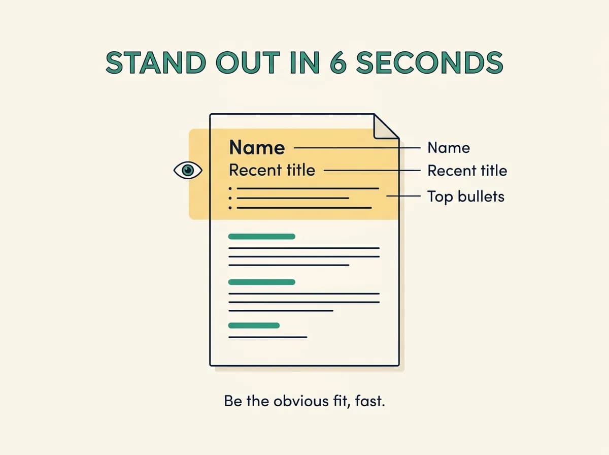
Win the six-second scan
Recruiters spend roughly six seconds on the first pass — about the time it takes to lose interest in a group chat. In those six seconds their eyes hit your name, your most recent title, and the top third of the page. That is where your best, most relevant, most quantified content has to live.
The practical rule: whatever makes you the obvious fit should be visible without scrolling. A sharp professional summary plus two or three strong opening bullets does more for your callback rate than anything below the fold.
Tailor to the job (this is the real cheat code)
The resume that stands out is the one that looks suspiciously perfect for this role. Mirror the posting's title in your summary, reorder your skills to match its priorities, and lead your top bullets with the most relevant wins. Tailored resumes score dramatically higher with both the ATS and the human behind it.

Format so a robot can read it
Fancy formatting is where good candidates quietly disappear:
- Single column, standard headings (Experience, Skills, Education).
- No tables, text boxes, or columns — parsers mangle them.
- Contact details in the body, not the header or footer.
- A normal font and your name as actual text, not an image.
Boring to look at? A little. Readable by the system that decides your fate? Completely.
When we tested real resumes through Talorr's parser, the "designer" resumes with sidebars and icon fonts consistently scored worst — not because the candidates were weak, but because the software dropped their skills, dates, and sometimes their name into the void. The plain single-column resumes parsed cleanly every time. Standing out starts with actually being read. See how to optimize your resume for ATS for the full formatting checklist.
Match the right skills, in the right words
A resume stands out when it echoes the role back at the employer. Pull the priority skills from the job description and mirror the exact wording — if they say "stakeholder management," don't write "worked with teams." This is the difference between a resume that's good and one that's obviously right for this job. It's also the fastest single edit you can make: tailor your resume to the job description before every application.
What to skip
Headshots (irrelevant and a bias risk), skill rating bars, an "objective" statement about what you want, and anything that requires a design degree to parse. Save the creativity for your portfolio, where it belongs.

The one-page rule (for most people)
Standing out also means respecting the reader's time. For the vast majority of candidates, one page is right — it forces you to cut everything that isn't your strongest, most relevant proof. Go to two pages only with a genuinely long, senior track record. If you're unsure, our guide on how long a resume should be walks through the exceptions.
Make every application the obvious fit
Talorr scores your resume against any job, flags the missing keywords, and rewrites weak bullets to lead with impact — so instead of looking different, you read like the candidate the role was written for.
Frequently asked questions
- What makes a resume stand out to recruiters?
- Quantified achievements, a clear match to the specific job, and clean formatting the ATS can read. Recruiters scan in about six seconds, so leading with numbers and the most relevant wins beats any visual design trick.
- Should my resume have colors and graphics to stand out?
- Keep it minimal. Heavy graphics, columns, and color often break ATS parsing and add no value. A clean, single-column layout with strong, quantified content stands out far more reliably than a flashy template.
- How can I make my resume stand out with no experience?
- Lead with transferable skills, projects, coursework, and internships, and quantify whatever you can (users, hours, percentages, team size). Tailor the resume to each posting's keywords and keep the formatting clean. Relevant proof beats years of experience for entry-level roles.
- Does a resume template help you stand out?
- A simple, single-column template helps by keeping formatting clean and ATS-readable. Heavily designed templates with columns, sidebars, and graphics usually hurt because parsers misread them. Your content — quantified, tailored, and relevant — is what actually makes you stand out.


